bylder suite

About the project
GOALS
- Create a scalable website to support growing marketing and sales efforts
- Bring four products together under one coherent product story
- Strengthen bylder’s positioning as a mature SaaS platform backed by an elite design agency
- Develop a visual and motion system capable of scaling across campaigns and sales channels
- Create faster paths to alignment by moving quickly from ideas into production-level concepts
CHALLENGE
- The website had to do more than present a product — it needed to define the story of an evolving suite
- Four separate tools needed to be brought together under one coherent offer, while still remaining distinct and understandable
- Alignment was difficult with shareholders, product, marketing, sales, motion, and copy teams all having different priorities and perspectives
- The visual brand for the suite still needed to be developed as part of the process
- The site needed to support growing marketing and sales use cases, particularly as a conversion channel in in-person commercial contexts
Solution
- Led the website strategy, design and development end-to-end.
- Drew on four years of product experience to help shape not only the site itself, but the wider thinking around what bylder should become as a connected suite.
- Worked across product, marketing, sales, copy and motion teams to turn competing inputs into a more cohesive direction.
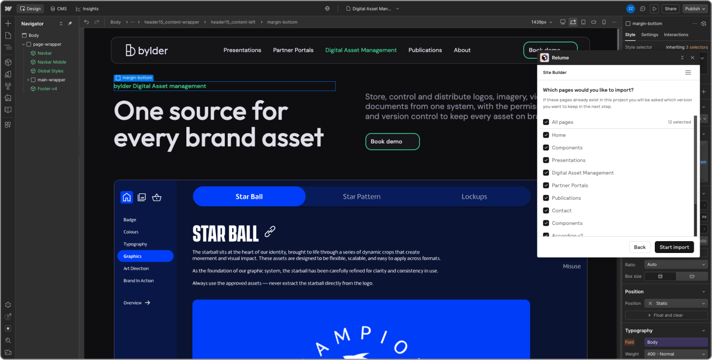
- Used rapid development workflows, supported by Relume AI, to quickly test ideas and make stronger decisions around quality, speed and scope.
- Developed a visual and motion system that helped explain product relationships while creating a more distinctive experience.
- Used production-ready environments as alignment tools, allowing teams to react to real experiences rather than static deliverables.
- Built reusable patterns and assets that extended beyond the website into wider marketing and sales channels.
Let's Jam
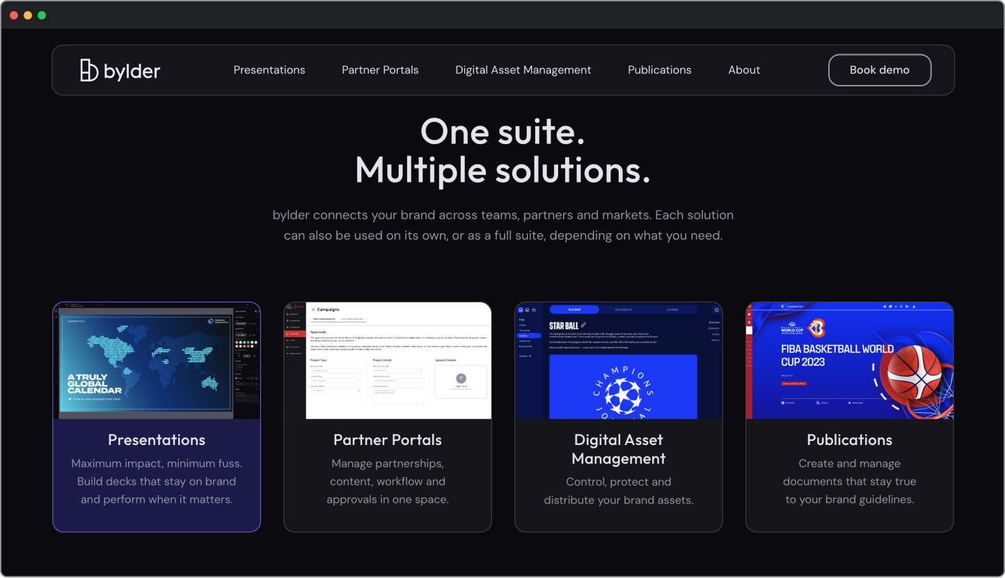
Defining the Suite, Not Just the Website
A key part of the work was helping define what bylder should feel like as a connected suite — not simply designing what the website should look like.
At the time, the four products operated more like separate tools than one coherent offering. Working closely with sales and marketing teams, I helped shape a clearer narrative that brought them together under one system while still preserving clarity around individual product value.
The result was a website that acted as a strategic product layer — translating complexity into a clearer commercial story rather than simply presenting features.


Turning Ambiguity into Direction
The project involved multiple teams, competing priorities and no obvious path forward.
To accelerate alignment, I used rapid development workflows supported by Relume AI to turn early ideas into production-level concepts. Reviewing work directly in-browser made it easier for stakeholders to react to tangible experiences rather than static wireframes or abstract discussions.
This created momentum earlier in the process and helped drive better decisions across positioning, messaging and visual direction.

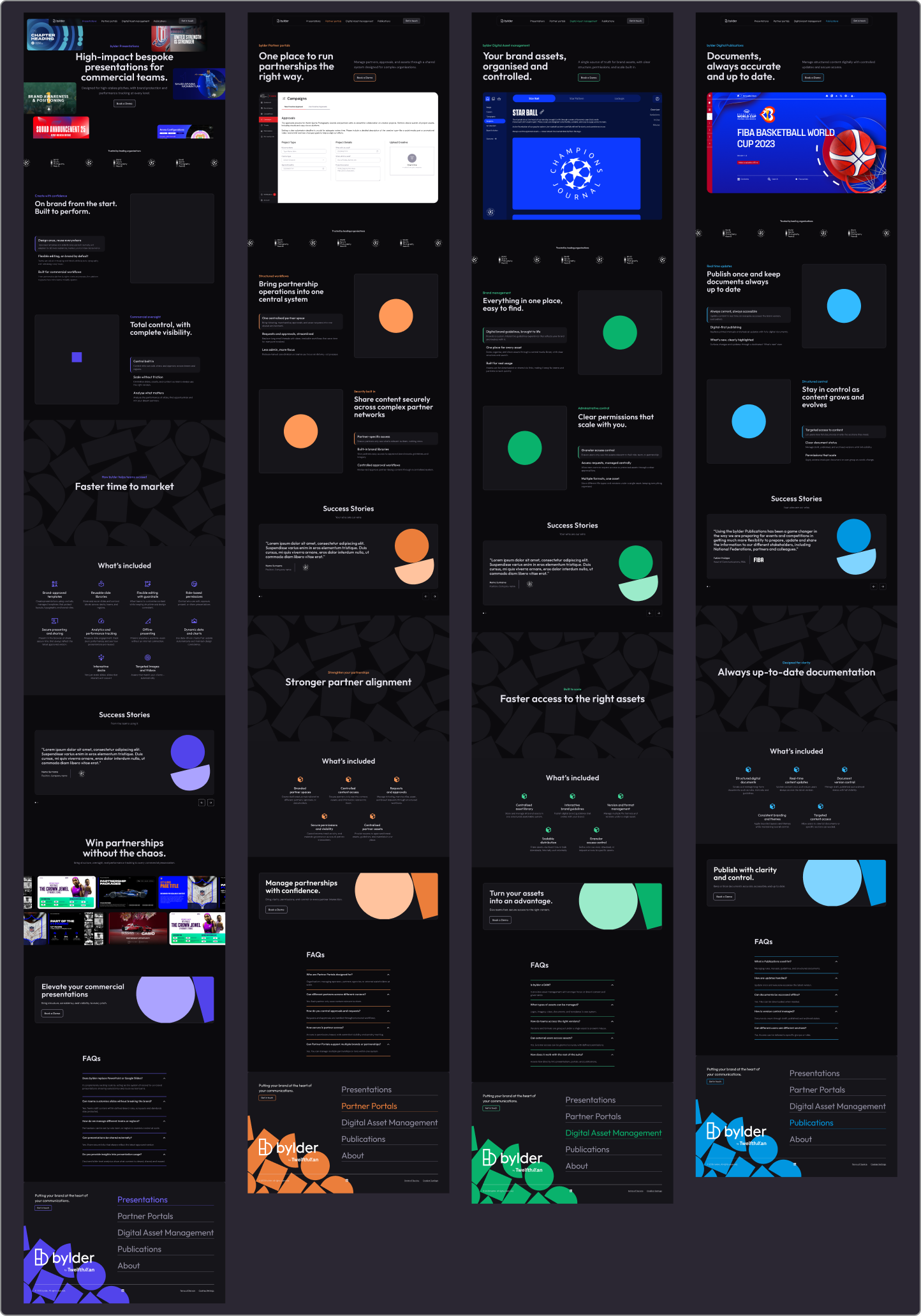
Building a Brand System for the Suite
The website also became the place where the bylder suite started to feel like one stronger, more premium product brand.
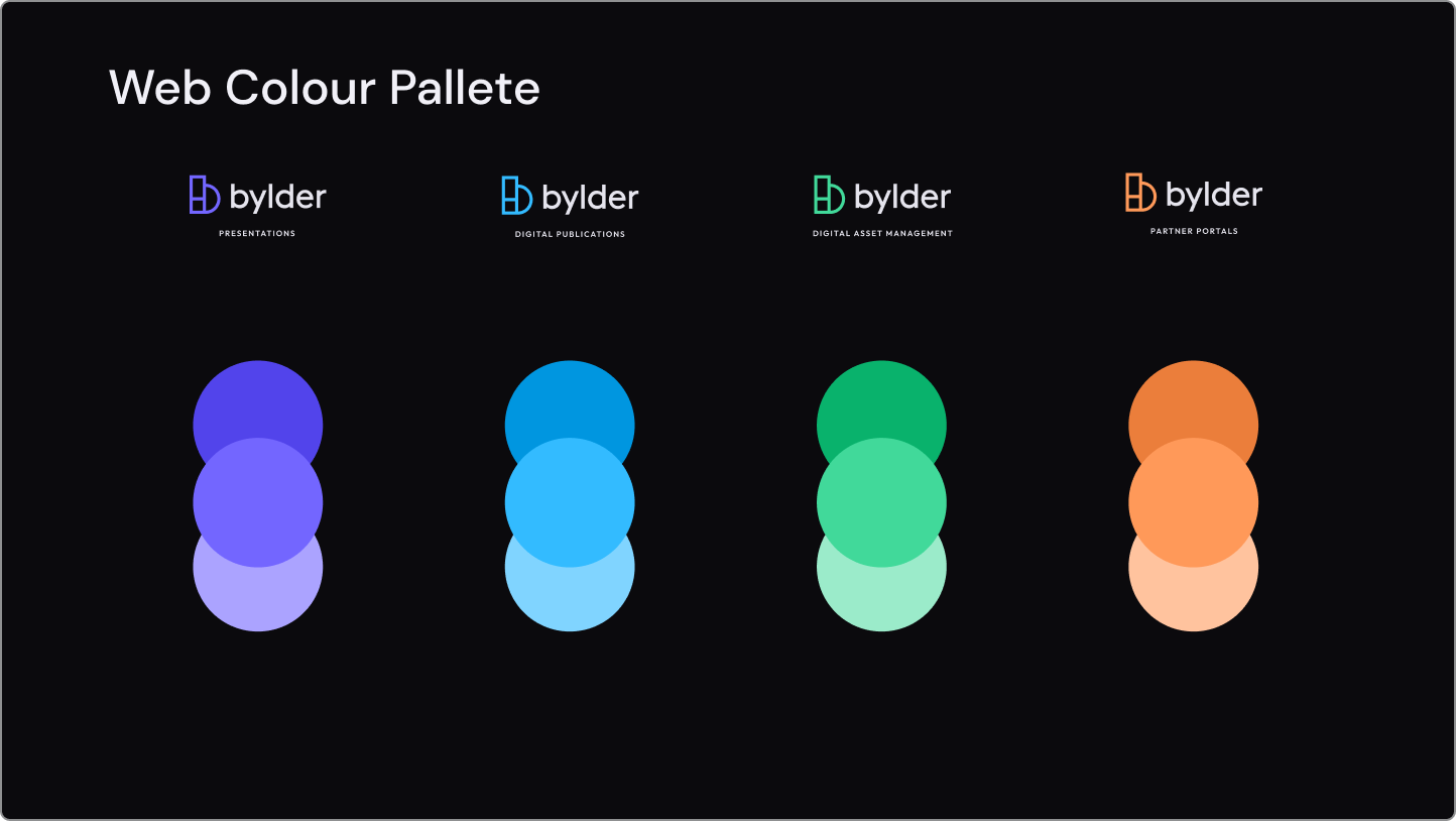
A big part of the work was developing a visual system that brought the four tools together through shared colour, hierarchy, and structure, while still preserving enough distinction for each one to feel specific and useful. The goal was not just consistency, but cohesion - something that made the whole offer feel more intentional and mature.
Utilising my product knowledge, I designed a system that uses simplified pallet of the in-product design system.
This cohesion between brand, product and web appearance strengthen bylder’s positioning as a premium SaaS suite rather than a collection of disconnected tools.

Using Motion to Add Clarity and Character
Motion was treated as a communication tool rather than visual decoration.
Working closely with the motion design team, I helped develop lightweight Lottie animations that added rhythm, explained relationships and strengthened storytelling throughout the experience.
The goal was to create interactions that felt purposeful and product-led while maintaining responsiveness and performance.
Many of the visual assets and motion principles developed for the website were later reused across broader marketing and sales channels.


Outcome
The result was a scalable marketing website that gave bylder a clearer story, stronger positioning, and a more cohesive web presence.
The site became a core sales and marketing surface—used to support conversion, in-person commercial conversations, and wider brand communication—while also helping internal teams align around a more unified expression of the product.
More broadly, the project showed how web design can act as a strategic product layer: clarifying the offer, shaping perception, and creating a stronger foundation for growth.
Social Media
