bylder
About the project
GOALS
Create a scalable design system to accelerate the design and development process. Ensuring consistency, accessibility and a modern UI.
Fix, build on top and create new features for the platform. Including overhauling the building experience, creating an Analytics Dashboard, improving the Resource View and Theme Builder.
Lay the foundation for bylder to evolve into a full end-to-end sponsorship platform - where teams can build presentations, pitch to partners, manage relationships, and track progress in one place.
CHALLENGE
The product has been growing organically by adding features on demand from clients. Resulting in an elaborate tool with many features, roles and permissions. I have had to structure all of that into a coherent easy to use experience without alienating the existing user base.
The presentations themselves are web-based - essentially mini websites - allowing for a smooth, interactive pitch experience and detailed analytics. But that also introduced complexity: the structure had to follow web development rules, which posed challenges for brand designers, sales reps, and non-technical managers building these decks.
The product lacked a design system.
Solution
The project kicked off with building a scalable design system - accelarating the development process, ensuring consistency, accessibility, and a brand-aligned UI across the platform.
From there, I broke down existing flows and optimised them by analysing established patterns, reviewing competitor experiences, interviewing users, and working closely with developers and stakeholders to ensure feasibility within time and budget constraints.
I also helped shape and design entirely new features - balancing long-term product vision with current client needs.
Let's Jam
Design System
Establishing the design system from scratch for a product of such scale was a challenge. Ensuring we have an asset for everything we need, needed and will need. The trick here was to go into detail about everything creating a scalable system of components and nesting them together. This allowed us to design Flows and test solutions very quickly. The nested components meant that with just 1 click my team and I had access to all components properties that make up our master component. Basically making better UX for ourselves.


Redesigning the Theme Builder
One of bylder’s biggest USPs is that every presentation stays on-brand - no matter who’s building it. That means marketing and sales teams can create decks without breaking layouts, misusing styles, or uploading off-brand content. But to make that possible, the product needed a strong foundation a robust Theme Builder.
To design for that, I researched leading web design systems, interviewed clients on how their teams operate and presented design solutions to gather feedback, to unlock the full potential of this feature.
The key issue was the lack of context when setting up the Theme Builder. So the solution presented itself - a live preview of design assets as the user is updating the Theme Builder. To do this I set up a two-tier menu, grouping related controls together and added a live preview panel.

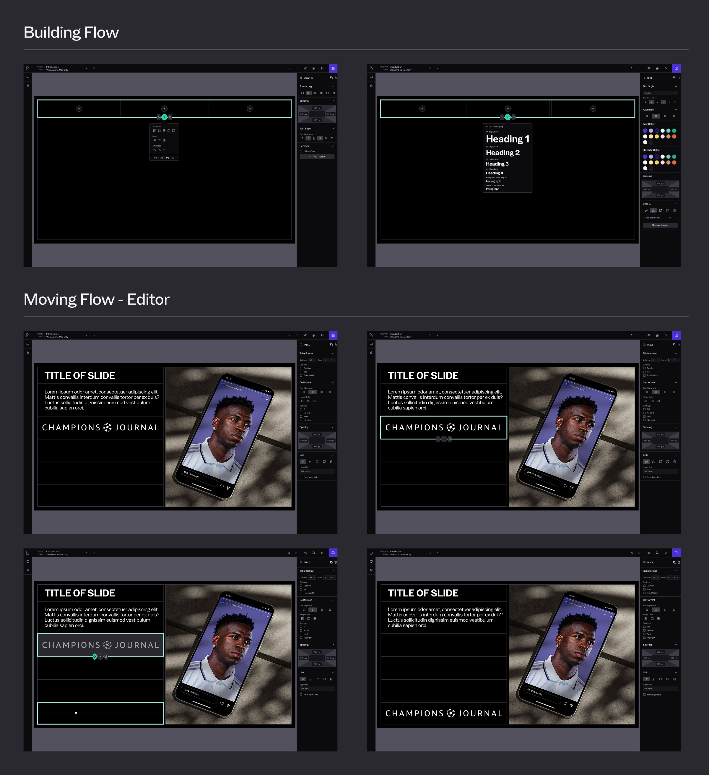
Overhauling the Editor Experience
bylder has 2 main sets of users - Designers who need full access to editing and need to create assets and layouts, and Marketing/ Sales Representatives who can not be trusted with brand decisions but need access to quickly update numbers on deals, client they are pitching to etc.
So when speaking with clients what came up the most is: "How do I design and build layouts using the web structure?" and "How do we ensure we can edit presentation without breaking layouts?" - very representative of the challenges these 2 different User groups faced.
So to tackle the issue of non-technical users having to build and edit within the web structure, I designed a context-aware Add Modal based on what the user is adding and if there is a structure to support that component. The modal is also categorised based on what building block is added - Structure/ Basic/ Advanced. This made the flow more intuitive and faster.
As for updating content, we had to create a Roles/ Permissions system to limit the control over Presentations that Sales/ Marketers have. However, with each role in every organisation having variations on what “limited control” meant - we had to allow Admin Users to edit Permissions within a general “Role”, allowing full flexibility to our clients.
Presenter Mode
One of the perks of being a web-based Presentation tool is that our clients can pitch to their prospects using the tool from any device. While having access to their notes and a built-in timekeeper, without the Viewer seeing any of that.
Of course, Users should always be able to send the presentation to their Prospect Partner and let them go through it on their own time, share within the team and get sign of to do the deal.
Which is why I had to design 2 different responsive Presenter Environments. The first one being the Presenter - Presentee one. As well as a "Traditional Presentation View". The challenge here was to keep the layout of the screen flexible, both so it can fit on different devices but to allow users access to their Notes and Timekeeper.

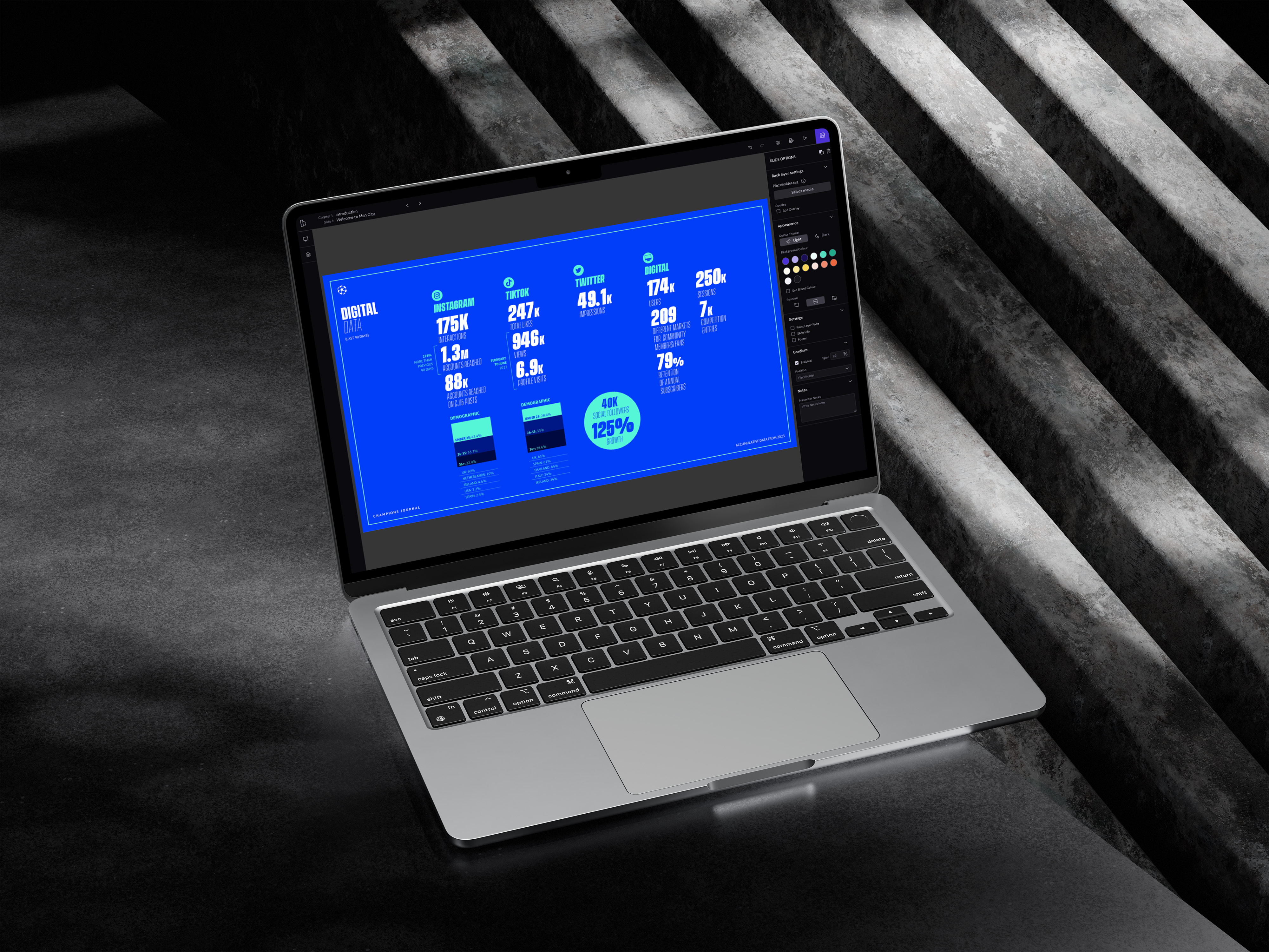
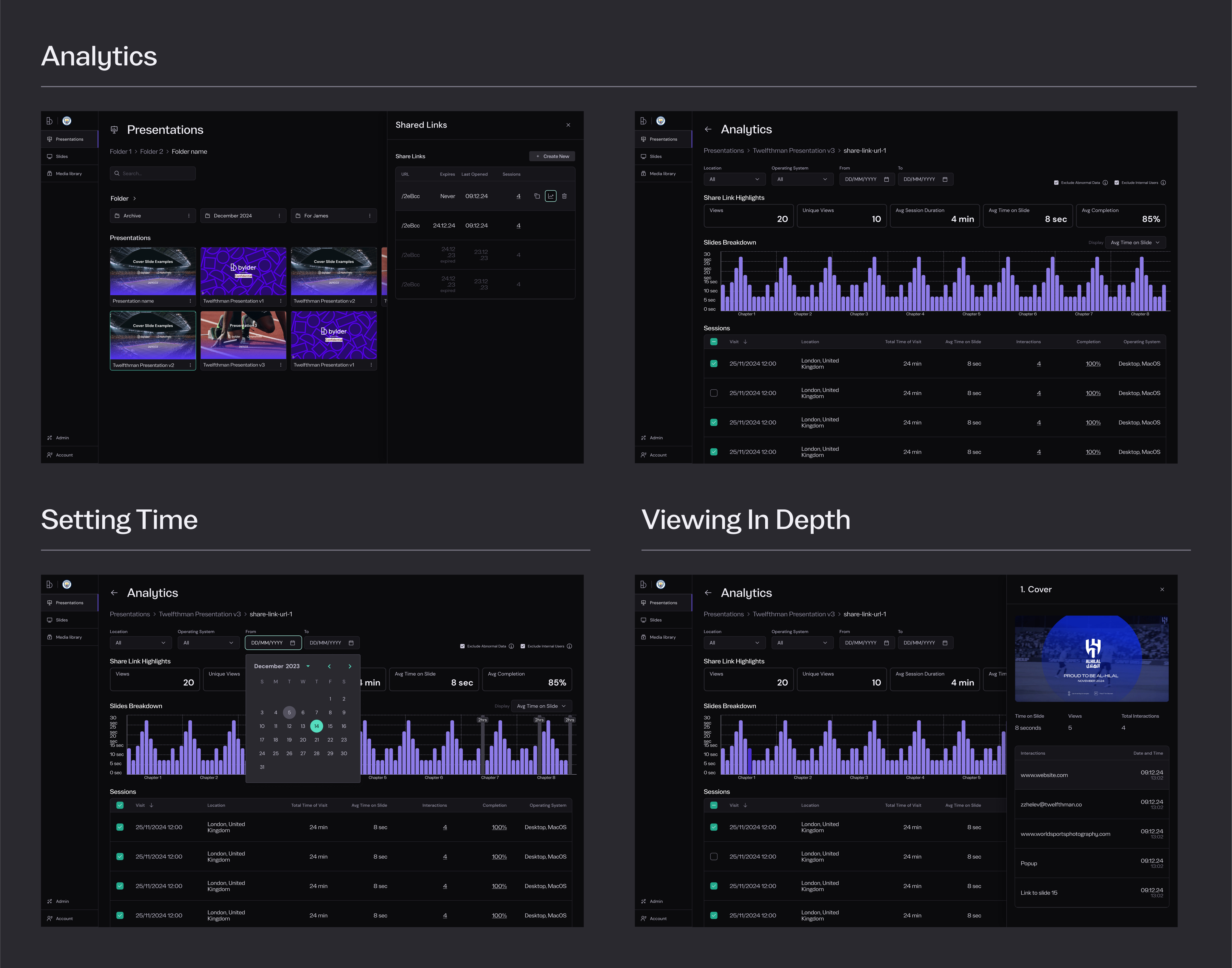
Analytics Dashboard
The long-term vision for Bylder is to evolve into a full Partnership Management System — not just where presentations are built, but where relationships are tracked and grown.
One of the first steps in that direction was adding analytics to presentations. Since the decks are web-based, we had access to rich data: number of views, internal shares within prospect organisations, completion rates, and more.
The challenge was clarity — surfacing the most valuable insights without overwhelming the user, especially when a single deck could have thousands of sessions.
I followed my usual approach: research, design, share early, gather feedback, and iterate. I worked closely with users to understand what data actually mattered at each stage of the deal, and shaped the dashboard around those needs — giving users control over what they see, and how they see it.
The final dashboard made complex data simple — giving users just what they needed, when they needed it.


Social Media
