Online Brand Guidelines

About the project
GOALS
Digitise Manchester City’s extensive brand guidelines (originally a 200+ page PDF) into an interactive, immersive, and inspiring online platform.
Enable internal teams and future collaborators to stay on-brand, easily find assets, and create stunning work.
Additionally, create a bold, immersive one-page highlights site to generate excitement around the brand refresh and give fans a glimpse into the new identity.
CHALLENGE
Brand guidelines are typically long, dry documents filled with rules, examples, and assets — with limited navigation and poor discoverability.
Because this platform represented the brand itself, it needed to be a pixel-perfect expression of Manchester City's identity — not just in content, but in form, feel, and interaction.
Solution
Designed a navigation system that made finding specific rules and assets intuitive and effortless - essentially creating the “dream” design system documentation.
- Grouped content into logical, modular sections for clarity and scalability
- Designed interactive widgets and components to elevate engagement
- Designed motion assets that reinforced the brand narrative and guided the user journey using Lottie animations for ultimate performance.
- Built an interactive microsite in Webflow as both a standalone promotional piece and a gateway to the full guidelines platform
Let's Jam
Research & Planning
I believe that one should design quickly, fail often and iterate.
The start of any project is when ideas are cheapest to test — that’s why I kicked things off in FigJam.
It’s far quicker to explore structure with stickies than to jump into wireframes or polished design.
Since brand guidelines are targeted documents — primarily for designers, photographers, and copywriters — I began by studying the original PDF, identifying patterns, and understanding how different teams used the content.
From there, I mapped out several structural options and collaborated closely with the client to refine them. We landed on a format that was easy to navigate, told a coherent story, and remained consistent across all asset types.


Wireframing
With the structure nailed down in FigJam and approved by the team, wireframing became the fun part — turning sticky notes into visual blocks and letting creativity lead. This is where I started thinking about layout, interactions, animations, and where things might not be holding up.
A key part of my process is gradually increasing fidelity — expanding the scope just enough to spot friction early. Because I hadn’t locked anything in yet, it was easy to pivot, explore new ideas, and stay flexible while pressure-testing the structure in a more realistic context.


Interactive Widgets and Navigation
One of the core goals of the project was to make the platform engaging and interactive — something that felt more like a product than a static resource. This was an opportunity to design micro-interactions that not only brought the brand to life but also made the content more useful and intuitive.
Some of the key components I designed included:
Colour Checker to ensure accessibility and contrast across brand colours
Before/After Slider to showcase image treatment styles
Hover-based Iconography Explainer to explain the legacy of the iconography
Lockups Previewer for quickly viewing logo combinations in different configurations
Animations to demonstrate brand behaviours like rotation, spacing, and alignment in motion (for which I learned Lottie Animations)
One of my favourite touches was also one of the simplest: a small link icon that appeared on hover next to section headers, allowing users to copy direct URLs to specific content blocks. This made sharing parts of the guidelines across teams seamless — solving a real UX pain point in large documentation platforms.

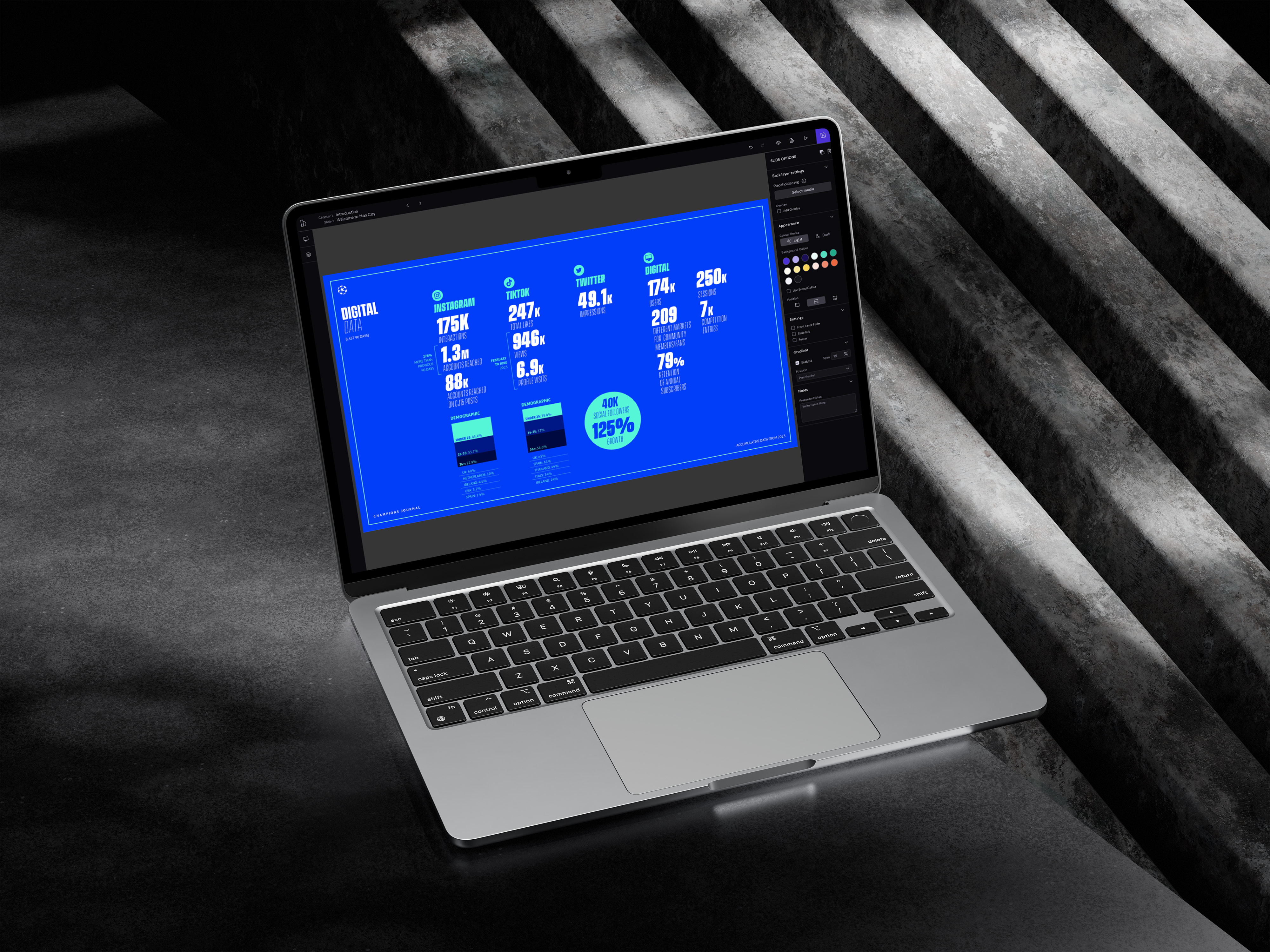
High Fidelity Design
This was the stage where everything had to come together — and it had to be pixel perfect. Because the platform itself was a representation of the brand, every component, type choice, and alignment decision needed to reflect the guidelines it was built to communicate.
I focused on applying the refreshed brand with care and precision — making sure it felt consistent, elevated, and unmistakably “Citeh” at every level. From margins to motion behaviours, every detail was considered through the lens of the brand’s voice and visual language.

Landing page/ standalone website
This one was all about getting the narrative right — finding the balance between showing just enough to inspire, but not so much that anyone could go off and create Manchester City-branded materials themselves.
The goal was to introduce the refreshed brand in a bold, playful way that captured attention without giving away the full toolkit. It had to feel premium, confident, and unmistakably City.
My favourite touch was the “moving bee” — a scroll-based interaction that brought a playful energy to the page while subtly reinforcing the club’s identity and motion language.

Social Media
